MosDataviz
Time series
Definition: A time series is a set of regular time-ordered observations of a quantitative characteristic of an individual or collective phenomenon taken at successive, in most cases equidistant, periods / points of time. [1]
1. Historical examples
According to Edward Tufte [2], the scientist Johann Heinrich Lambert is the first person to introduce time series to scientific literature in the 1700s. Few visualisations are known however.
Another first creator would be Joseph Priestley who, in 1765, had created time line charts, in which individual bars were used to visualise the lifespan of a person, and the whole can be used to compare the life spans of multiple persons. [3]
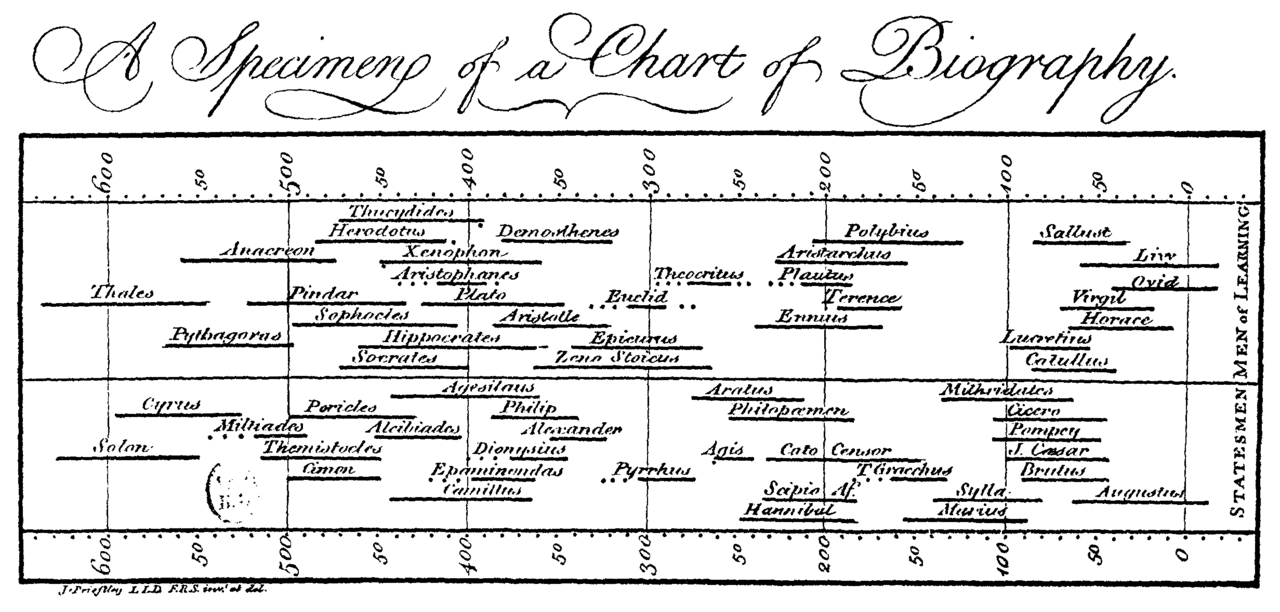 Priestley’s Chart
The Scotsman William Playfair, used also time series graph to display the very famous trade-balance time-series chart between England and Denmark and Norway, in 1786 [4] and the first graph using a line moving up and down as it progressed from left to right to show how values changed through time. These graphs were included in his The Commercial and Political Atlas (1786) [4] to argue against England’s policy of financing colonial wars through national debt.
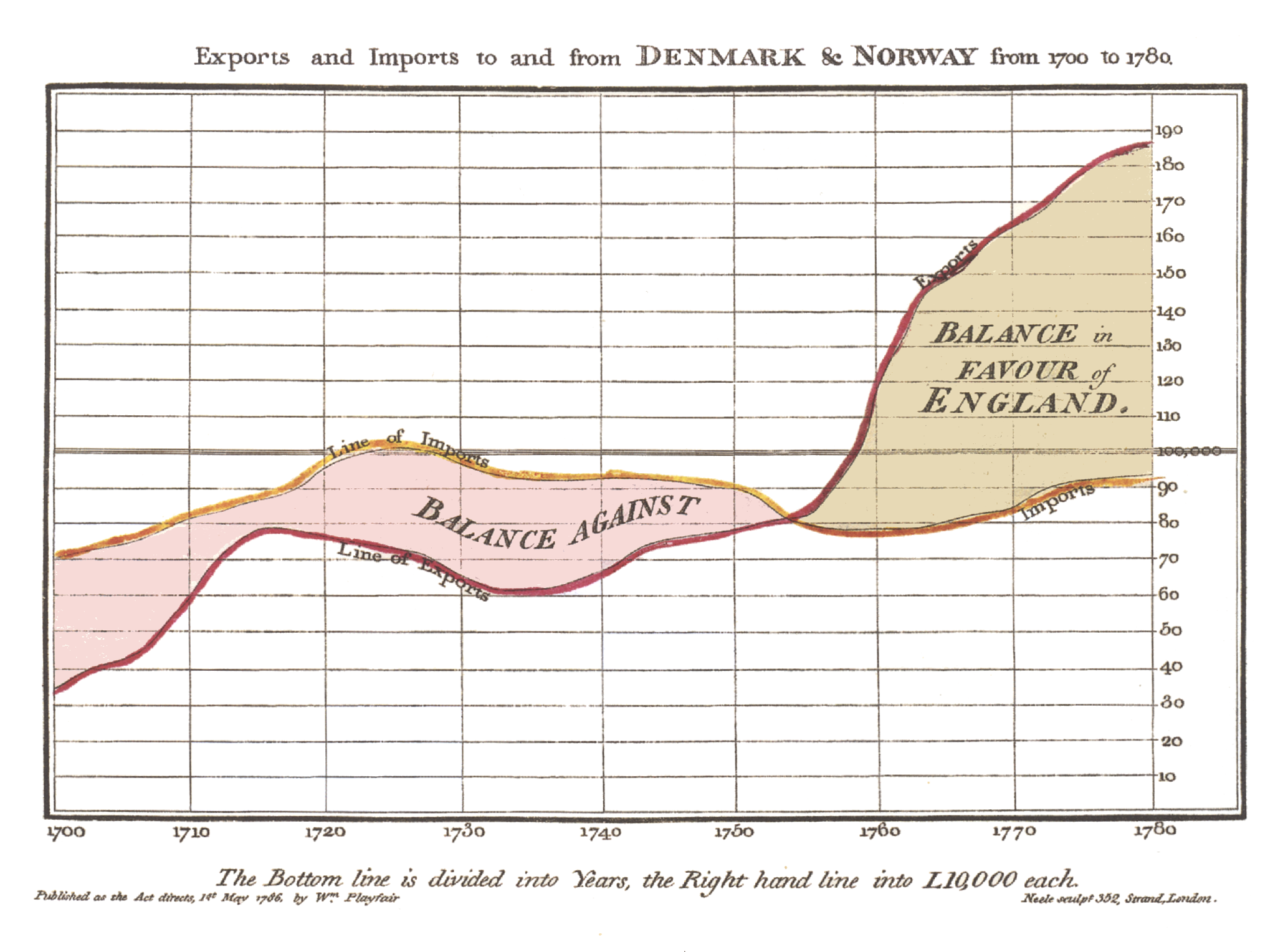 Playfair Balance Chart
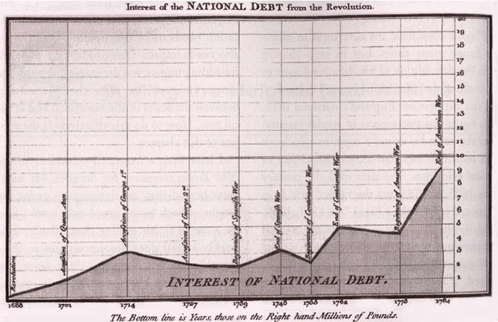 Playfair National Debt Chart
This last chart is the one we are most familiar with. Like the previous one, the area is underlined to show that the data displayed here are concrete and measurable quantities (money), and the rise of the debt must strike the reader.
2. Recent most famous ones
Complex time series involving dozens of them to be compared fostered innovations.
The simplest one is the reduced line chart, which display stacked time series. Its simplicity makes it easy to quickly understand the shape of the graph but it also hinders its performance: it can be difficult to differentiate a maximum value in a specific point.
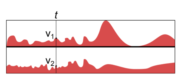
Horizon graphs aims to solve this problem: introduced in 2005 [5], it allows a very dense amount of information in a very limited place, useful for financial visualisation.
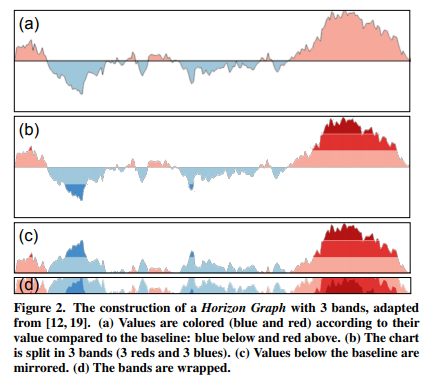
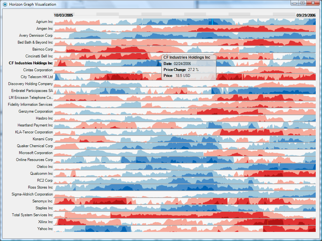 Horizon graph
Other types of graph can be noted such as the braided graph and the slope graph.

The braided graph is a design choice to show overlaid time series. It is most useful to see the intersections of the two but its readily is quickly affected, despite the color code.
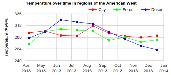 Slope Chart
The slope chart is the well-known graph using broken segments to link data points. Distinctive colors let the user follow with ease every trend. Caution should be taken when the y-axis is translated to the relevant part: variations are interpreted in relation with the other trends and not much in absolute.
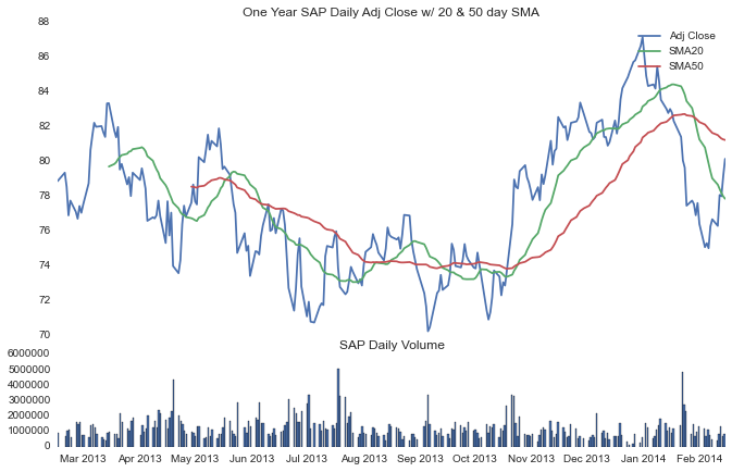 Stock market graph
It is often used to represent stock market evolutions.
 The March of Progress
A peculiar time series is the March of Progress by natural history painter Rudolph Zallinger in 1965 for the Early Man volume. As the traditional way to represent time, this time again, time is represented through the x-axis, whereas the y-axis has not much meaning. The representation of the Evolution of Homo Sapiens is however easily grasped by the reader and proved to be very popular and often altered for other intents (such as the one displayed above).
3. Comments
We have described only the most common time series visualisation, but some variations exist such as an Interactive Horizon Graph [6], that allows modifications of the parameters from the user. http://www.aviz.fr/Research/IHG
4. Sources
[1] OECD Glossary of Statistical Terms - Time Series Definition. (2005). Retrieved January 13, 2018, from https://stats.oecd.org/glossary/detail.asp?ID=2708
[2] Tufte, E. R. (1983). The Visual Display of Quantitative Information. Cheshire, Conn.: Graphics Press
[3] Beniger J. R. and Robyn D L. (1978). “Quantitative graphics in statistics: A brief history”. In: The American Statistician. 32: pp. 1–11.
[4] Playfair, W. (1786) The Commercial and Political Atlas.
[5] Saito, T., Miyamura, H. N., Yamamoto, M., Saito, H., Hoshiya, Y., and Kaseda, T. (2005) Two-tone pseudo coloring: Compact visualization for one-dimensional data. InfoVis ’05 , 23.
[6] Perrin C., Vernier F., Fekete, J. (2013) Interactive Horizon Graphs: Improving the Compact Visualization of Multiple Time Series Proceeding CHI ‘13 Proceedings of the SIGCHI Conference on Human Factors in Computing Systems pp.3217-3226